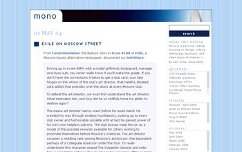
Designing With Jazz Standards - Version 3.0

Version 3.0 of mono was inspired by the cover of Sarah Vaughan's self-titled album Sarah Vaughan, released in 1954 on EmArcy, and also known as Sarah Vaughan with Clifford Brown. It is a fantastic jazz recording, yet a fairly recent acquaintance.
I have always liked black and white photographs with a slight blue or bluegreen tint, which also seems to be a rather common theme in jazz (and the odd soul record, such as Aretha Franklin's Spirit in the Dark).
And I really love the color scheme of Sarah Vaughan.
Verve did a particularly good job of matching the original cover art for their reissue (all newer reissue covers on Verve place the original cover on a more or less matching background - sometimes it works, sometimes it doesn't).
However, the colors in the image shown here are different from those of the actual cover, which looks a lot better. The logo and main title, in particular, are considerably less aqua than they appear here. Also, for some reason there is a different cover on the Verve website.
Version History
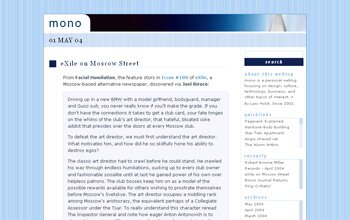
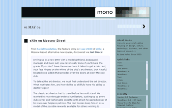
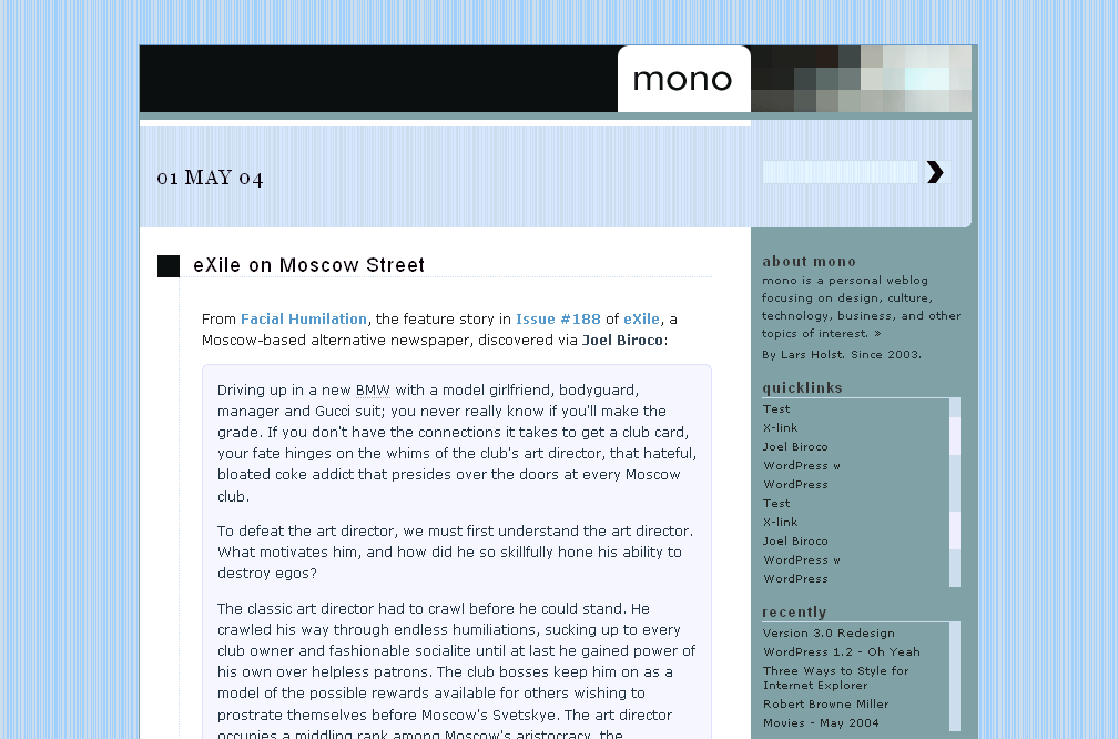
The 3.0 redesign is best summarized as evolutionary and unstructured, and followed upon an intense period of minor tweaking that had taken the design from version 2.0 to 2.5 in a mere two weeks, as seen in the screenshots below.
Changes from version 2.0 to 2.5 also included markup and stylesheet tweaks that aren't visible on the second screenshot.
-
Version 2.0 - April 29, 2004
-
Version 2.5 - May 14, 2004
-
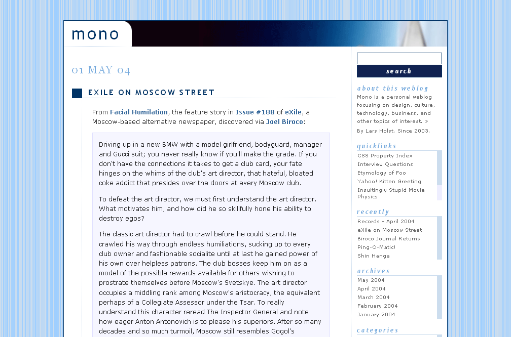
Version 3.0 - May 30, 2004
Design Goals
The design goals for version 3.0 focused on:
- Standards - ensure that the new design complies with web standards.
- Evolution - analyze existing design in terms of keep/change/add.
- Efficiency - minimize changes of markup and style.
- Aesthetics - aim for a softer, more colorful minimalism.
- Presentation - strengthen the presentation of posts, if possible.
- Typography - consolidate font and text properties.
- Whitespace - balance the use of whitespace.
The next sections willl look at the design goals in more detail.
Standards
Previous versions of mono had already been designed, developed, and published with web standards in mind, specifically XHTML 1.1, CSS 2, and the latest build of WordPress (currently version 1.2, which just happens to be named after Charles Mingus).
Special care had been taken to make sure that the markup was semantic and reasonably accessible, and the color scheme had been tested as being safe for color blind readers, using the Colorblind Web Page Filter.
The absence of image replacement techniques and a sensible choice of foreground/background colors had ensured that there was no loss of textual information with CSS on/images off.
The design also worked well across major browsers, handled window and text resizing adequately, and was continously tested in the latest versions of Firefox and Opera on Windows. A separate cascade was fed to Internet Explorer through a conditional statement in the
section of the document, ensuring acceptable rendering in IE6/Win (IE5.x was not catered for, on any platform).With this in mind, the first design goal was easy:
If it’s fixed, don't break it.
Evolution
The redesign started with an analysis of the existing design, to decide what worked and what didn't. Such an analysis serves to make the redesign goals simple, at least in theory: keep what works, change what doesn't, and add what's missing.
I wanted to keep the two-column layout with the sidebar on the right, as it is a proven, working concept for weblogs. Granted, there are other layouts that work, but I saw no need to change something just because it was possible.
My changes focused on the visual aspects of the site, in essence colors and typography.
I didn't see the need to add anything to the front page at this time. I have a to-do list, but it mainly concerns non-weblog content, such as a colophon, and a contact form that isn't part of my personal website.
Efficiency
Being short on time, I wanted to reuse as much of the existing stylesheet as possible, and preferably not touch the markup at all.
I decided to set a specific deadline for going live with the design, so as not to risk a prolonged and time-consuming tweaking process.
Although this wasn't a commercial project, I found that working against a deadline was both challenging and helpful. It forced me to make swift decisions on issues that would otherwise have remained unresolved, simply because I would have felt that there was "no harm" in waiting.
There are also synergetic effects to be had, as one decision usually leads to another.
Aesthetics
I wanted to preserve a minimalistic look, but use more colors and different graphics than before.
More colors in this case meant both a wider range of colors, and a (somewhat) larger number of colors.
For lack of a better term, I refer to this as "colorful minimalism".
Other than this, I only had a vague notion of wanting something that "looked better". Although not too helpful, this was in fact the most important criteria.
Presentation
I was reasonably happy with how the main content (posts) was presented, and so decided to leave most presentational aspects, including the layout, as they were.
As a result, all major structural elements of the page (date, title, content, search box, navigation) remain in the same place as before.
However, to fulfill my "more colors" objective, I had to apply a background color to the sidebar, which had previously been the same white background color as the main content.
I was curious as to how this would affect the presentation.
There seems to be a fine line between unobtrusive sidebars that help draw attention to the main content and visually disturbing ones that scream "look at me, I'm important!", which, of course, they are not.
Although there are as many variables when working with sidebars as with main content, the most important ones seem to be color, particularly background color, font size, and to a lesser extent width (for an example of a weblog with a wide sidebar that works really well, see Richard Rutter's Clagnut).
It is too early to tell how the current design parameters work in this regard. I must have tried forty or fifty different color combinations, and I am far from happy. This is where the deadline came in handy, or I would still be tweaking the night away.
Typography
I probably spent too much time on typography. I kept going back and forth between serif and sans-serif fonts, not being able to decide which font worked best, at what size, and where.
There was also a complex interplay between the main content and the sidebar, and between numbers and letters.
Georgia remains my favorite font for Arabic numerals, and I decided to keep it for the post date and comment numbers, while changing all other heading fonts to Arial.
Typography geeks may question this decision. So do I.
The header font proved to be an easier task. It is set in 36pt Futura, a font suggested by Joel Biroco back in February. Thanks Joel.
Whitespace
I tried to pay particular attention to the use of whitespace — the open space between design elements — which I think is one of the most misused design techniques on the web.
Good use of whitespace acts as a visual guide for the eye, and helps separate, structure, and present content; too much whitespace abandons the content in a sea of emptiness and creates an overall sense of unbalance, particularly for regular visitors, while too little distracts, confuses and causes uneasiness.
Whitespace can also end up being too white, when in fact it doesn't have to be white at all. Finding that delicate balance between whitespace and the structural elements of a page is a challenge.
In the end, I don't think the redesign had any particular effect, neither positive nor negative, on whitespace.
The one exception is the date of the latest post, which is now surrounded by considerably more whitespace than before. I like it, and I think it puts a clearer focus on an important piece of information.
Diversions
As the original design idea evolved, I tried to take the Sarah Vaughan color palette, with its hints of steel, concrete, and artifically contained water, a step further.
My goal was to have the overall design evoke a late 1950s, early 1960s feeling, and, to a certain extent, I think it does. I am not too sure about this white background though.
For a while, I even toyed with the idea of going for a "genuine" 1960s style design, as if this was a weblog that had actually been designed and published in that time period. Just for fun.
I don’t think I have seen it done, at least not on a weblog.
In the end, there wasn't enough time (or indeed artistic and PhotoShop skills) to pursue the concept any further.
I still find it an interesting idea though.
Limitations
Image Replacement
Previous mono designs used plain text to render the main heading. With this version, I decided to replace the header text with a graphic, basically for the reasons Cameron Adams outlined in Balanced branding.
I first opted for the Phark Revised image replacement technique, which relies on text-indent to move text away from the viewport. This method is accessible for screen readers and looks good with unstyled content as only the heading is visible. It also uses very simple CSS, requires no additional markup, and works for linked images.
The disadvantage is that it does not work with CSS on and images off, a common scenario when on a dial-up, and one that directly affects me, as I do most of my non-work related browsing with a 56k modem.
Even so, I felt that the potential loss of information was acceptable because of the redundancy provided by the page title.
I would not recommend using this technique to replace lower level headings, or other important textual information.
The alternative to Phark is the Gilder/Levin method, which works fine with CSS on and images off, but adds an empty element.
Since I don’t see the empty element as a problem for a single instance of replacement, I ended up implementing a somewhat modified, somewhat simplified version of the Gilder/Levin method, because of the slight advantage of having a readable header with CSS on and images off.
These are the modifications I did:
- use
instead of - move empty element to make it work for a linked image
Using instead of is just a matter of taste, and does not affect how the method works. I chose simply because it is shorter. Both elements are semantically meaningless, which is what matters.
The Gilder/Levin method will not work as is for linked images, hence the second modification.
Here is the markup and style in use now (some attributes and styles have been removed for clarity):
mono

h1 a {
        position:relative; /* absolute works too */
        width:120px;    /* width of image */
        height:60px;    /* height of image */
        cursor:pointer; /* for ie */
}
h1 a i {
        position:absolute;
        top:0;  /* not always needed */
        height:100%;
        width:100%;
        background:url(mono.png) no-repeat;
}
As shown above, the empty element needs to be put inside the anchor for the technique to work with linked images. Also note that, for some reason, Internet Explorer needs an explicit cursor declaration.
Tested in Firefox 0.8, Opera 7.5, and Internet Explorer 6, on Windows.
Fixed Width
The second limitation of this design was the introduction of a fixed 750 pixel width. Previous versions used a variable width, set as 75% of the viewport, with minimum and maximum widths of 600 and 850 pixels respectively.
I switched to a fixed width at the start, in anticipation of a design that would rely more closely on a precise horizontal alignment of elements.
As it turned out, I think I could have made the variable width work, but it just didn't seem worth the effort to recalculate and revert the styles back again.
And I guess there is always the comfort of being in good company.
Summary
The redesign stretched out over two days, and took about five hours effectively, despite my intentions to do a quick, evolutionary redesign. On a sidenote, those five hours would probably have been too long had it been a commercial job.
It would have been interesting, and probably more time-consuming, to start from scratch, Bowman-style.
This was actually my original intention, but sometimes inspiration gets in the way. Maybe next time.
The design is still a bit rough around the edges: the color scheme needs further tweaking, as do a few other minor details (antialiasing, border widths, font sizes, hover states, the usual stuff…)
And I still haven't given up on that 1960s style weblog.
17 Comments (skip to form)
Leave a Comment
Comment Information and Guidelines
- Trackback URI for this post
- Comments are the properties of their authors.
- Email addresses will never be shown or shared with third parties.
- Offensive, distasteful, and irrelevant comments will be deleted.
-
HTML is optional, but if you do use it, please make sure that:
- markup is well-formed and valid XHTML 1.1
- ampersands (&) are encoded as
& - angle brackets (< and >) are encoded as
<and> -
HTML allowed (please close tags):
seriocomic
Comment on May 30, 2004 at 9:06 pm
Sweet job Lars — two thumbs up!
I can't believe it only took 5 hours (and more disbelief in you thinking that was too long!)
I really like all the changes you have made.
I will be incorporating some of your ideas when I tweak for 1.2 in June.
Lars Holst
Comment on May 30, 2004 at 10:19 pm
Thanks for the kind words Mike. I didn't ask anyone to check the design before going live, so reading your comment felt most reassuring.
I am of course assuming thumbs up down under don't mean thumbs down up here?
So you read all that? Wow. At the end of writing this post, I wanted to put in an executive summary that read "Bit of a redesign, bla bla bla…". Well.
Ha, I'm curious as to what ideas you could possibly incorporate from this redesign? Whatever you do, just don't touch too much. You wouldn't want to shock your fans now, would you?
Five hours, indeed. But that is my estimate on the effective amount of time I spent on this. It did take me two, almost three days from start to finish, not counting writing this post.
Is that quick or not? I really don't know. I just did a rough estimate based on how much I thought someone would be willing to fork out for a redesign; what that would translate into when broken down on those five hours; and whether or not that would be enough to support a business. I guess those assumptions don't take into account all the necessary details, but still.
I don't think I could have done it faster though, and that's what bothers me, if only a teeny weeny bit.
Do let me know if you encounter any anomalies.
Anne
Comment on May 30, 2004 at 10:36 pm
Too bad you needed to support both Mozilla and Internet Explorer, Opera would have supported
h1>a::beforeto be absolute positioned. (Not that I am a Opera user…)Lars Holst
Comment on May 30, 2004 at 11:52 pm
Anne, thanks for your suggestion. I'll have a look at that, even if it's just an Opera feature.
Sure you didn't mean to write "Note that I am a Opera user…"?
I do like the 7.5 release a lot though. I would even argue that it renders faster than Firefox.
As for IE, I wouldn't exactly say that I need to support it. I am pretty sure that most if not all of my (two?) regular visitors have ditched that relic of a browser a long time ago.
I have chosen to do it mainly as a service to casual visitors who end up here via search engines, and whom I assume represent the bulk of the IE UAs I see in my stats. Those hits make up for roughly half of my total visitors (Google loves me!), which makes that particular demographic group a bit too large to ignore.
Lars Holst
Comment on May 31, 2004 at 12:04 am
By the way, Anne, since you wondered (yeah, I read that title attribute on your weblog), your comment didn't show up at once because I have comment moderation enabled.
There's a note on this under "Comment information and Guidelines", just below the textarea.
Just because you don't have any comment guidelines, doesn't mean…
Anne
Comment on May 31, 2004 at 12:26 am
I actually meant 'not'. I'm quite happy with Mozilla 1.8a2, which I can update every day
Nice looking smileys by the way.
Roger
Comment on May 31, 2004 at 10:52 am
Very nice!
Five hours for this redesign sounds pretty quick to me, so don't worry about that.
I appreciate that you've put Lucida Grande first in the list of fonts — it looks superb in Mac OS X
Lars Holst
Comment on June 1, 2004 at 12:47 am
Thanks Roger.
I guess I am comparing the design process to the design implementation phase, i.e. the editing and/or creation of code and graphics that results in the changes. The actual work, or labor, of editing the stylesheet and the graphics in this case comes down to perhaps 20 minutes. Thus the difference between this phase and the total time invested in the process makes for some sort of efficiency measure, which in this example would be
1/25, although I am not sure what the benchmark should be, or indeed how meaningful this measure is.Obviously, such "inefficiency" is inherent in every creative process; artists spend time conceptualizing, developing, sketching, rethinking, etc. a particular artistic idea, before implementing it (through the act of painting, sculpturing, etc).
But web design, like most commercial creative work, is not art, so it's different.
Oh, I am glad you like the look of Lucida Grande. My choice of fonts is based on Real World Style: Fonts for Unix.
david
Comment on June 1, 2004 at 2:18 am
5 hours css design… and then 10 hours writing about the design process?? whoa.
Lars Holst
Comment on June 1, 2004 at 9:03 am
Haha David. If I had spent 10 hours writing this post, you would be impressed, not sarcastic.
I think it was more like an hour and a half. Luckily, I don't count that in for the efficiency measure.
Joel
Comment on June 1, 2004 at 4:43 pm
I like it too, it does have a retro feel, I mean genuinely retro rather than pseudo-retro. I'm sure you know the subtle difference of which I speak.
One thing, it took me two days to work out that the small rectangular patch that changes colour on a mouse action above was actually a search box. I've been thinking it was something that didn't work in Opera and I'd have to try it in another browser to see what on earth it was supposed to be.
Asbjørn Ulsberg
Comment on June 1, 2004 at 7:20 pm
I think it would be better to have an XHTML 1.0 Strict DOCTYPE than XHTML 1.1, because 1.0 is acceptable to send as 'text/html', but 1.1 isn't. 1.0 Strict and 1.1 have approximately the same DTD, so you won't need to recode anything to switch. Just replace the DOCTYPE.
If you were to obey the 1.1 rules, you wouldn't be able to support Internet Explorer, which doesn't eat 'application/xhtml+xml'. But with 1.0, it's quite OK (but not recommended) to serve documents as 'text/html'.
Other than this, the design is really elegant and tasteful. I like it a lot.
Lars Holst
Comment on June 1, 2004 at 9:50 pm
Joel,
Thanks for your kind words and feedback. Yes, genuinely retro, that was what I was aiming for. Pseudo-retro rarely does it for me, although there are exceptions. I am for example rather fond of the Henry Kloss Model One, but I guess it helps that it sounds great too.
Thanks for alerting me to the search box, and sorry for making you go to the trouble of testing in another browser. I anticipated confusion, but I liked the subtle contrast betwen the input fields and the surrounding background too much to change it. I did put a title attribute on the input element, but, apparently, it won't display. I have moved the title to the
formelement instead, which seems to work better.In the process I also discovered that Opera doesn't pick up text-indent on a submit button, but I will have to save that for another day.
Asbjørn,
Thanks very much. Actually, I am aware of the document and MIME type issues you are referring to.
I use server side scripting to send content as application/xhtml+xml to user agents that know how to deal with it, and as text/html to those that don't.
You are of course right in that the difference between 1.0 Strict and 1.1 is negligible. To be honest, I have no good reason to use 1.1 over 1.0 Strict.
Field of Stars
Trackback on June 1, 2004 at 11:30 pm
Life Design
From an old issue of Wired, Rem Koolhaas interviews Martha Stewart. I just love that he interviewed her, and although my opinion of her is highly ambivalent, I love some of the things she has done (who else can we…
mathibus.com
Trackback on June 27, 2004 at 11:12 pm
Spring Redesigns: A List Apart
I made a chronologic (well, pretty much) list of websites that a) I regularly visit AND b) have redesigned in the past spring. I might have missed out on some (I welcome suggestions in the comments), but I think I got the most "important" ones…
Word up – It's the A–Dawg
Trackback on November 1, 2004 at 2:19 am
links for 2004-11-01
halfproject (categories: candy flash illustration multimedia) Hiking - Mountain Photos at Couloir.org (categories: candy climbing flash photos) Relevare vector zooming done well. from 2002 (categories: candy flash navigation ui)…
Words.Digitalgrafis.com » Blog Archive » Whitespace in Design
Pingback on June 12, 2006 at 11:41 am
[…] “Good use of whitespace acts as a visual guide for the eye, and helps separate, structure, and present content. Too much whitespace abandons the content in a sea of emptiness and creates an overall sense of unbalance, particularly for regular visitors, while too little distracts, confuses and causes uneasiness.” (https://larsholst.info/blog/2004/05/30/version-30/) […]